How did the ‘Sisters with Blisters’ fare at the Jersey Relay Marathon
-

John Gamble
Director, Professional ServicesAfter competing in the Standard Chartered Jersey Relay Marathon this weekend, my team (the Sisters with Blisters) was keen to understand our official results and see how we compared to the other teams. That was a bit tricky, despite the wonderful Marathon organisers posting the results up early the day after the event the format was a static PDF. This was somewhat cumbersome to work with.
So, here’s our version using Microsoft Power BI. First up, it is very easy to connect directly to the PDF document online. Power BI recognises the table embedded in the document and we are away. Next, was a bit of data prep, namely calculating the difference in time between the segments for each team and pivoting to the data set to work on rows rather than columns. Producing trend or series data is much easier when working this way. Then we turned on Power BI’s ability to profile data and a small number of errors were detected so these were removed too. We then augmented the data set with some friendly names for each of the relay legs and our data set was complete. We then added calculations for Average, Min and Max Time and Pace to see how we compared.
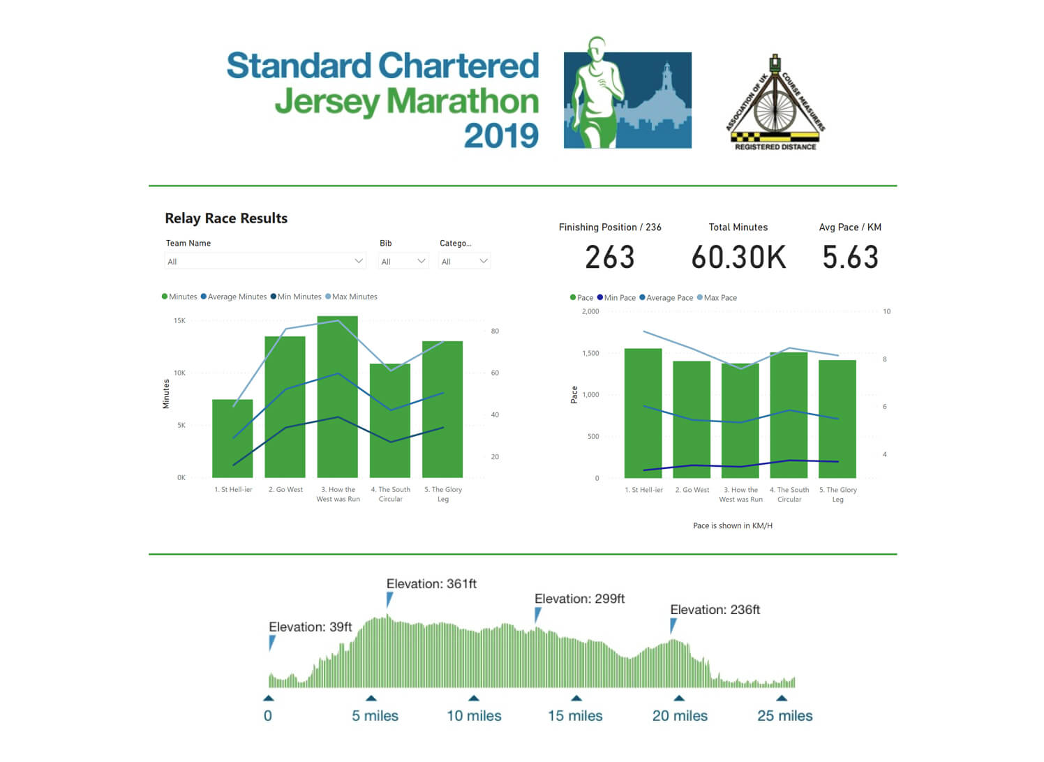
Power BI is known for its visualisation and dashboarding capabilities. After we had the data model, producing the dashboard was straightforward allowing us to interpret the results.
All in all, it was an hour or so’s work before publishing the results using the ‘Publish To Web’ feature. The publishing part is paid for, but all of the data prep, profiling, modelling and visuals was done using Power BI Desktop. Not bad for a free tool!
So how did the “Sisters with Blisters” finish? We were 214th out of 263 teams. We had an average pace of 6:03 min/Km – we were very happy with that! For me personally, I had Leg 2 (the uphill one!) and my 56 mins for 9.6km was 4 mins off the average pace of 52 mins, but well behind the quickest pace of 34mins! Maybe next year I’ll try for the full thing, complete with a Power BI dashboard to match.
If you want to see how your team fared, have a look on the Power BI dashboard below (click the expand icon on the dashboard for a full screen view):